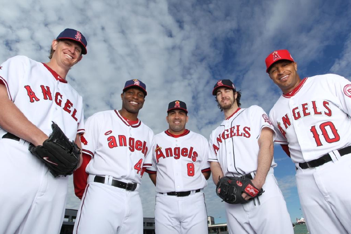
 Being totally honest with you guys... I'm SHOCKED I got through 11 months of blogging without gushing over my love on uniforms. Well, now that I've finally found out the lineup of "retro" uniforms that my beloved Angels are going to wear at every Friday Home Game, I can't hold it in any longer... I freaking love baseball uniforms (while were at it, uniforms in ANY sport are pretty bitchin', but baseball has the best). While this article might feel a little Uni Watch'y (the "famed" uniform periodical from ESPN.com's Page 2), believe me, it's totally ripping it off, and I'm seriously hoping Paul Lukas doesn't sue me.
While there are always some teams who just get uniforms right (The Yankees, Cardinals and Red Sox come to mind), there are other who just seem lost in their own awfulness. Take for example, the Seattle Mariners and their awful teal alternates:
 That color DOES NOT belong on a baseball uniform unless you have the misfortune of playing for the Marlins... and then, who gives a crap what you wear?
While I'm on subject, there is one Florida team who has finally done uniforms right after a decade of wrong. The Tampa Bay Rays (formerly the Devil Rays, and that connection to Satin must have been the source of those awful rainbow's uniforms), who have switched to some of the slickest jerseys in an AL East already packed with sexy uniforms. They have very neat home and away jerseys, with two equally as sexy alternates:
 Do you see it now, Seattle? There is a way to do light blues and dark blues and not muck it up on an annual basis. Tampa Bay learned their lesson, why can't you?
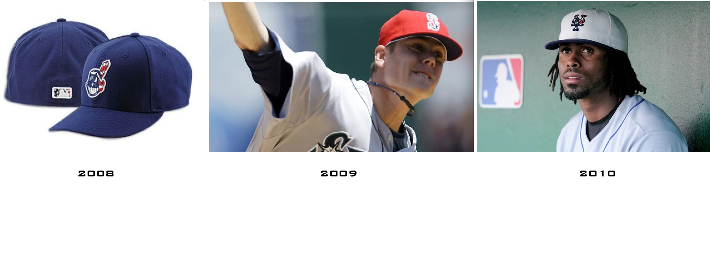
Sadly, the "Patriotism" caps will return for a 4th Season. I like the idea at first, and the blue hats with the logo colored by the flag were still the best looking of the set, and since then, they have just gotten worse and worse. The Red ones were ok for teams with red in their pallet, but they looked god awful on teams like the Dodgers and Yankees. Then last year came the white abominations they put on players heads with either red or blue brims... simply awful... No word yet on what will be the new design this year, but I can only assume it will be awful.
Speaking of the Dodgers, they have decided to bring back (in spirit only) one of the worst looking uniforms of all time. The results are actually pretty nice. Back in the 40's the Dodgers actually wore shiny satin blue uniforms for evening road games. The results were as humorous as they sound:
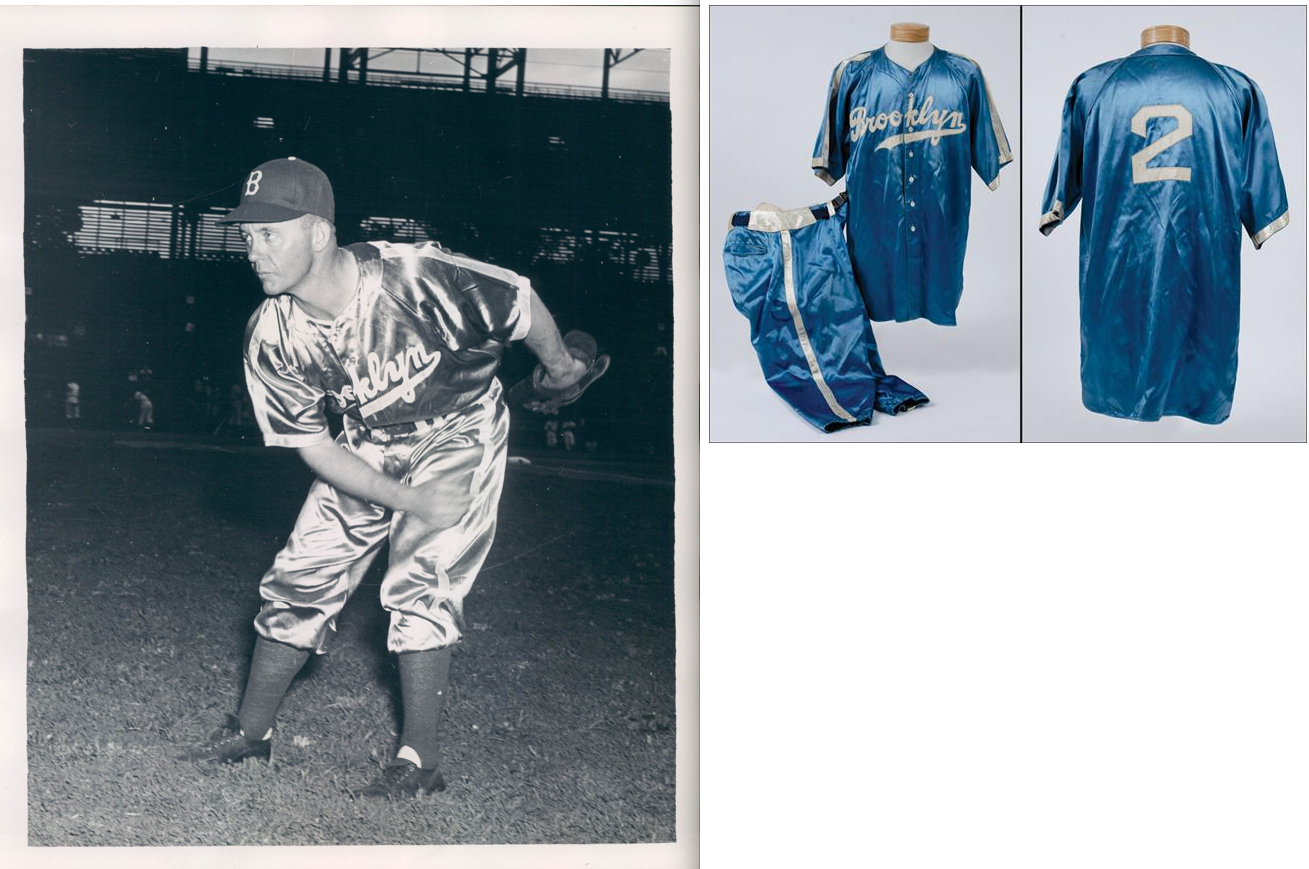 I encourage you, print this picture out and use it to tease all of your Dodger friends. "Yeah, we wore periwinkle for a time in the late 90's, but who didn't? At least we didn't wear this!" When I heard the Dodgers were bringing this back, I was SOOOOO excited for all the laughs this would get, however, they found a way to not totally screw it up.
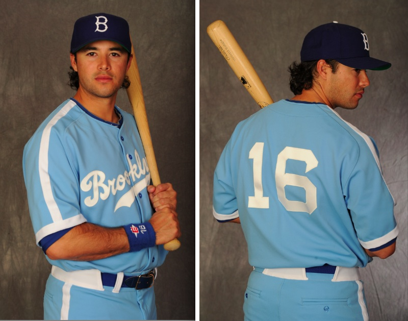 Pretty Slick, right? I'm actually jealous. Touche Dodgers.
So, that's about all the time I have to bore you with Baseball Fashion this week, but I'll be damned if I don't see some loser team wearing some loser alternate that I'll have to post about the second I see it. Oh, or someone like the Rays could come out of nowhere and put on another masterpiece of an Alternate jersey, and they will receive their due kudos.
I love the original Los Angeles Angels uni!
ReplyDelete@SBJohn - Yeah, those are probably my favorite Angels uniforms too... they are very slick.
ReplyDelete